So you’ve tried the cool, funny, original, minimal, abstract, enigmatic, intriguing, techno – what not. If you are still not happy with the looks, try going back to the very origins of electronic music. You have to ask yourself how it all started and what did the pioneers of electronic music have in mind when writing their pieces.
The answer is quite simple – it’s all about technology. So why don’t we start with some research first. Check out the major university websites. In your research, look for image libraries, press and releases. Very often, universities will have large databases of high resolution imagery from diagrams, historical scans, lab photos, machinery, electronics, space exploration archive photos and many other wonderful resources.
Let’s take an example. Stanford Linear Accelerator Center
From this site you can access two interesting sections:
After a long research and a bit of luck, we managed to back-trace the cover artwork for one of the best Goa albums ever released – “Pulse 6” double-CD compiled in 1998 by Alexander Ligowski under a German label “Sub Terranean/Euro Media”.
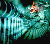
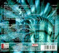
What looks like a complicated 3D render turns out to be quite a simple Photoshop edit. In the next few steps we will guide you through the process similar to the one used to create this album cover.
Research Step 1: Find your source:
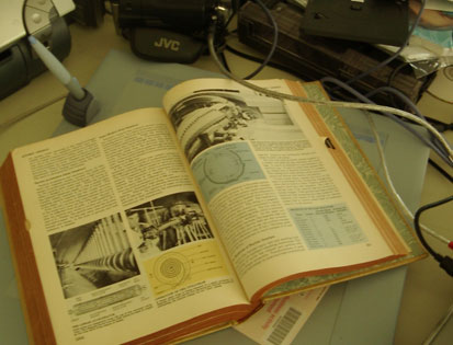
Research Step 2: Target an interesting image:
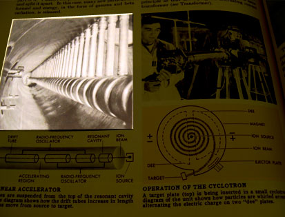
Design Step 1: Acquire an image.
You can scan, take a photo or try to back-reference the image and try to find a high-quality digital copy in resolution suitable for printing. As always, make sure you are not violating any copyrights so get in touch with the photographer for permissions before you spend any time on the design.
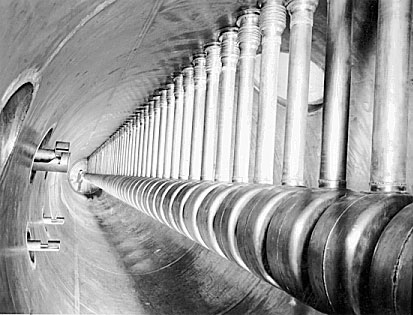
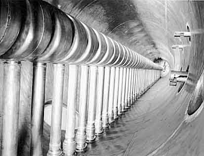
Design Step 2: Tweak it a little to your liking.
In this case the artist performed a simple 180 degree image rotation.
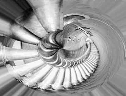
Design Step 3: Twist.
Duplicate layer and apply Filter > Distort > Polar Coordinates [Rectangular to Polar].
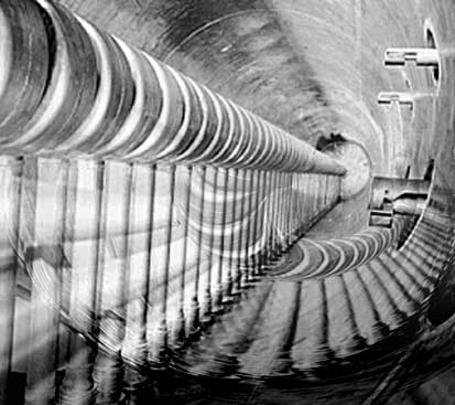
Design Step 4: Overlay.
The distorted image is now placed on top of the original with Linear Burn and a blending gradient mask making the image more transparent at the top. We’ve also removed the technician visible at the end of the cylinder in the original photo.
Design Step 5: Colour and final touches.
Brightness/Contrast, Hue/Saturation tweaks followed by doubling the layer with a softer overlay.
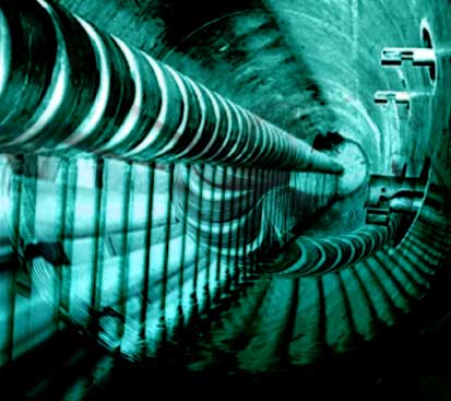
Your artwork is now finished and ready for detailing, such as logo, compilation / album title and credits. Back of the “Pulse 6” album is a coloured rotation of the distorted source photo.

This is the original album artwork designed by Georg Reimann in 1998.
The whole editing process should take approximately 15 minutes, depending on your Photoshop skills. If you make a cool album cover after reading this article, we will feature it on this page
